It is the final post of the series of ‘master the curve on LR.‘
In the first post, it presented the primary curve, and the second post was about the abnormal curve. In the final post here, I am going to show what I did on the fall look photos by adding the color to the curve.
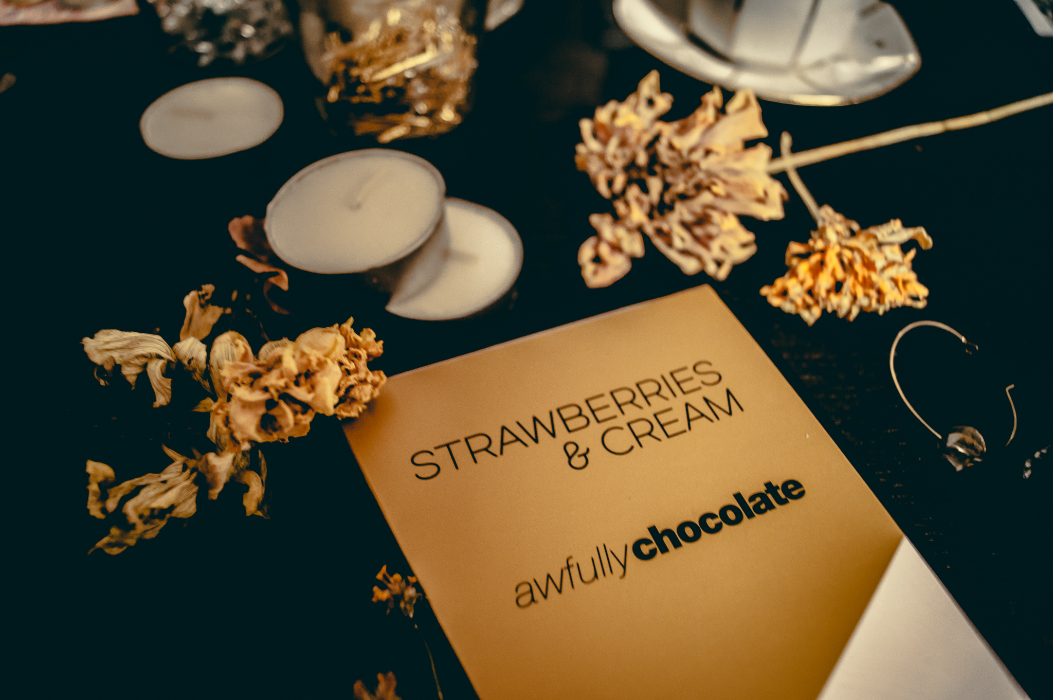
By the way, I took photos using in today's session at home. My friend got this chocolate from Awfully Chocolate from Singapore. (Thank you! It was delicious.) The package was very stylish, cute, and useful. Useful, why? I thought I could reuse the black package as a pencil case.
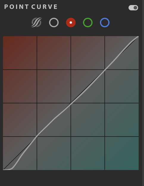
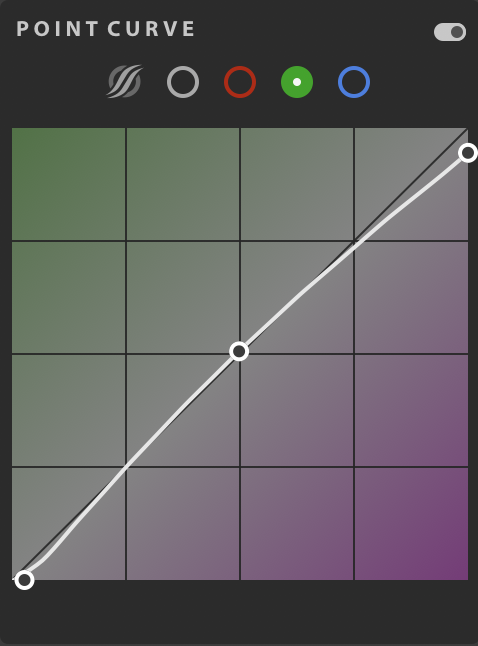
Let's see today's session, the curve graph.
The curve points were under the central y-axis to keep the photos as dark vintage look in a whole visual look. I don't go into details of the points here. Let me leave the curve graph to see.
Please see the simple 3 concepts of abnormal curve plus color curves.
1. Color curves are based on RGB and control what type of vintage look you want to see. (Warm: Yellow and Red. Cool: Blue and Green)
2. Move the tip of points to vintage styles you are going with photos.
3. Keep the central point in the middle.
The basic curve is the key overall, so please check other posts (#1 and #2), but if you can control the RGB curves, photos drastically change to have more essences in your style and product images.
You don’t need to master all of curve series. It’s all for your preference and purpose of the photos.
Hope those tips in the series help your LR work :)


