
This post is about Portrait. But beside of portrait photo techniques, I'd like to cover 'how to edit a portrait photo like vintage style.' This editing works out mainly in the scene along with flowers or the forest.
(*The technical side of shooting the portrait, please give me time, and I will post about the topic. )
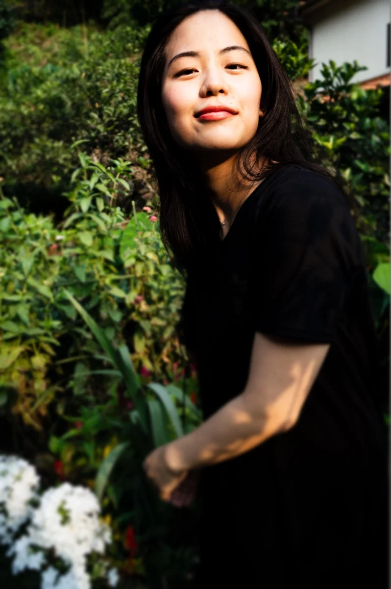
Here, the photo above is my sister, and we had this shooting at the grandma's house last month.
I like her smiling, but also her eyes look at the lens with the look "I know how you do." It was just naturally collaborated with my sister. Love it.
After posting the original photo on Instagram, maybe this photo could be right in the vintage style.
So here how I did. (Please click the right side of the photo below to see other adjustment tools)


Used VSCO
1. Contrast
I usually like high variations, but this time skipped contrast. It's because the original photo has the strong color differences in its antithesis, and this photo would want to go with the low-tone vintage look. So I got them even -2.0 to make her and black tops look softer.
2. Sharpen/Clarity
Those are important in a portrait shot. I like high sharpen and low clarity personally. But again, because of the original photo had a good resolution in it, so just left Sharpen +4.0 and clarity is as usual, between +2.5 and +3.5.
3. Saturation/White Balance
Those are easy. Make sure that you always control those two elements for colder or warmer look. Again, if you could adjust 'Saturation' and 'White balance' for cooler/warmer looking, you can make any types of photo styles.
This time is about vintage look, so saturation is -1.0 (did not go over beyond since the filter and contrast gave enough greyish tone. )
In White Balance, green was a little bit went beyond that I usually do, and it's also connected to the next step.
4. Skin Tone
After editing so much to make the photo look greyish, greenish, and low-tone, we cannot just leave without adjusting the face color of the person.
So when you adjust Saturation/White Balance, remember that changing Skin-Tone comes as a combo set.
5. Fade/Grain
Finally, Fade (!). Fade dramatically works out the portrait vintage look photo. The tools provided a photo softness and polished in the way of "polled off."
I actually (well, at least for me) challenged to +5.0. Adding Fade is my nervous point in editing. It's because it could ruin colors, contrast, or even the feeling of the object's character. But sometimes have to try this out drastically to break our comfortable zone. And I don't think I perfectly got this done. But I am happy that I could try to go beyond my comfort area.
--------------------------------------------------------------------------------------------------------------------------------------------
Lastly, let's go review.
1. Contrast could be the negative number if a model outfit is too dark or the original photo has the strong color sense.
2. High Sharpen is a key to define the face, but Clarity could kill the softness of the portrait face.
3. Control Saturation and White Balance and keep your eyes on the balance between the filter strength and those adjustments.
4. Use Skin Tone always after Saturation and White Balance to modify a model's skin color. (It's ultimate priority to make her/him look in a certain way.)
5. Level of Fade is under your preference. Use Fade for the portrait that gives the sense of the softness in the end.
Thank you so much for reading. Hope you got learnt something from reviewing the photo with me.
See you in the next post :)