Edit photo

How to take food photos at home (Dark moody look) by harumi


My first photography features were food and natures back in time that I started taking photos way before portrait or any product photos. It's just because simply I loved cooking (and eating) and wanted to store my food collection somewhere and started doing my first food blog back in 2010. It didn't go well (well, I stopped posting while getting into busy moments with study). However, that's been a part of my daily practice and a way of taking care of myself.
 

So, today, and in the next a couple of posts, I present taking food photography at home. The first post is about making it dark, moody look, the second post is more for a whitish-blight look. The third one is how to take food photos outside of a home.


Let's get started.

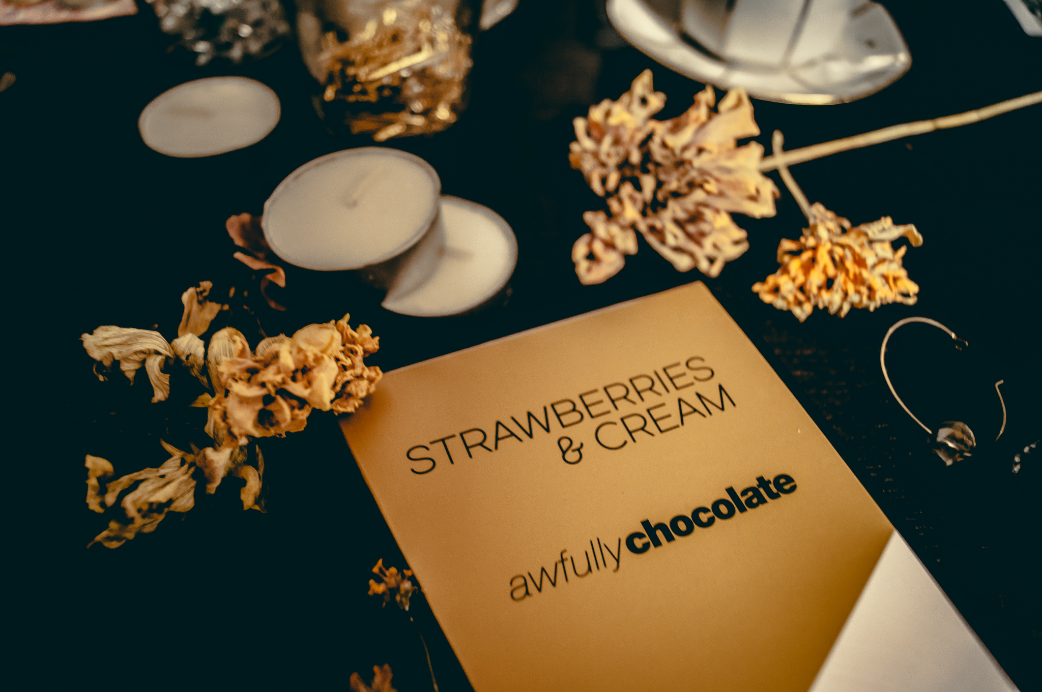
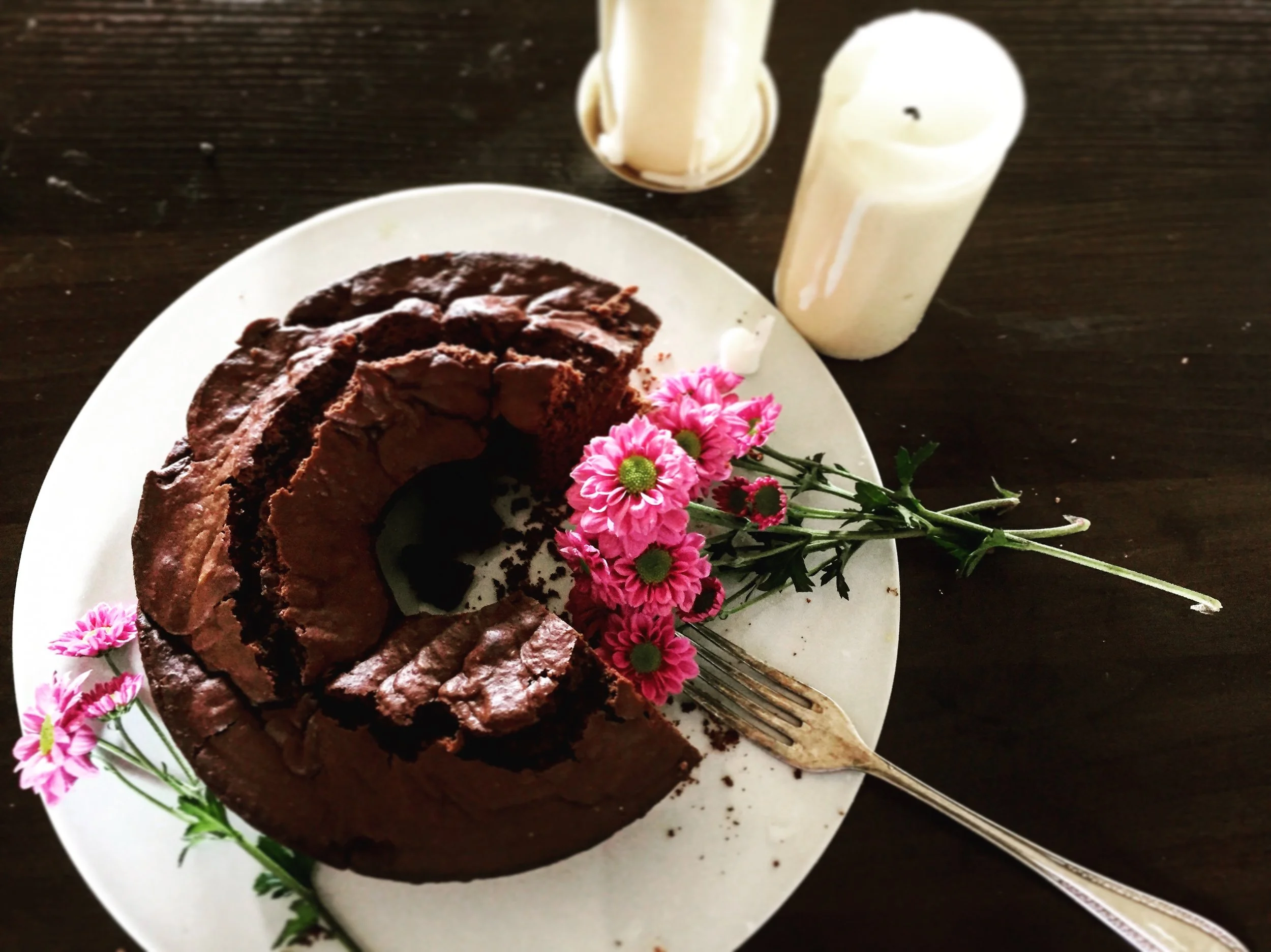
I took those photos last week. I baked banana-coconut oil cake in the morning, and the color of the bread significantly collaborated with the dark-brown kitchen table, and that light wood plate. So, that could be presentation materials of today's session.


There are three points I am going to cover in here. 1. Tips of decorations 2. White-balance 3. Color luminance


1.     Tips of decorations

For food photography, creating a mood for craving food you show is a key. To do so, you can use food/ingredients you used for a dish to make. In that photos, I put bananas, flour, nuts, and also measurement spoons. Not only ingredients but tools for cooking, such as measurement a spoon, fork, bowl, knife, cup, give the sense of reality and an image of proceeding you cooked.


2.     White-balance

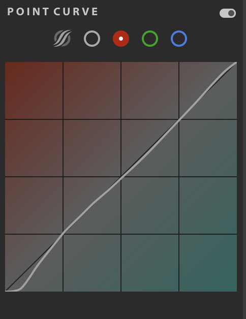
White balance is so essential for any categories of photography look stable. Even you take multiple photos (different angles, decorations, composition) in one series of the presentation, you do not want to change its style. In other words, you want to keep it under the same sense and make audiences comfortable to keep their eyes on that matter. From my experience, accommodating colors, exposure, highlight, contrast, and editing tools can be fixed for each photo, but it's necessary to keep White Balance same in every single photo. In this series of photos, I set WB as Temperature: 3,640 and Tint are -4. Made cool bluish look.


3.     Color luminance

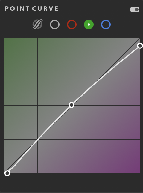
Finally, color luminance. I think that could be applied to all food photos no matter what types of look. You adjust (or add/decrease) color impact on photos. If you use bananas, then the yellow part should be adjusted to minus to emphasizes its color. I made -17 in the yellow zone here and changed Red, Purple, and Magenta to +100 for a little piece of dried flowers. Because of the dark, moody look in the whole photo, this color luminance gives photos having an effort in term of sensitiveness and details, not only a "mood."


I think that's it for today. Hope that I could leave tips and techniques of food photography at home…

Hope you enjoyed the photos and thank you so much for reading. : )

It's fall #3 -master the abnormal curve with the additional color curve- by harumi

It is the final post of the series of ‘master the curve on LR.‘

In the first post, it presented the primary curve, and the second post was about the abnormal curve. In the final post here, I am going to show what I did on the fall look photos by adding the color to the curve.

By the way, I took photos using in today's session at home. My friend got this chocolate from Awfully Chocolate from Singapore. (Thank you! It was delicious.) The package was very stylish, cute, and useful. Useful, why? I thought I could reuse the black package as a pencil case.

Let's see today's session, the curve graph.


The curve points were under the central y-axis to keep the photos as dark vintage look in a whole visual look. I don't go into details of the points here. Let me leave the curve graph to see.

Please see the simple 3 concepts of abnormal curve plus color curves.

1. Color curves are based on RGB and control what type of vintage look you want to see. (Warm: Yellow and Red. Cool: Blue and Green)

2. Move the tip of points to vintage styles you are going with photos.

3. Keep the central point in the middle.

The basic curve is the key overall, so please check other posts (#1 and #2), but if you can control the RGB curves, photos drastically change to have more essences in your style and product images.

You don’t need to master all of curve series. It’s all for your preference and purpose of the photos.

Hope those tips in the series help your LR work :)

It's fall #2 -master the abnormal curve- by harumi

In the previous post, I introduced the basic curve for still life photography. The critical part of it was the S curve hook to balance out brightness, contrast, and exposure. Today, it's a continued post, #2: Master the abnormal curve for still life photography.

I took those photos at the backyard of the flower shop, Flowers for Lena, a couple of weeks ago. Randomly pumpkins were left on the ground, and I felt this is the sense of the fall season starts.

For the curve session today, like last time, I leave the original photo in Raw and the point curve graph to show how I edited to make the fall mood on the photo.

As you see, the hook here is the not following the S curve hook theory. However, this curve also a format/form

This photo has a focus on objects, which are pumpkins, the background is dark, and there is no any particular thing to add the bright sense look. Therefore, I set each curve almost on the straight line to keep the moody look, not strong contrast or highlight. That emphasizes the fall pumpkins from the background.

On each point of curve lines, I left the ⇧ sign to see that the width of each end on the y-axis is getting to be narrow up to the top. Also, only in box #13, they have two points, which are a ‘starting point’ and ‘the second starting point.’ The role of the second starting point is to add vintage-polished essence by making the point be at the same y-axis level.

(By the way, the box #s are listed in the description of the first curve session. Please check.)

Beside that point, the curves do not interact with the center line. It's deviation from the standard straight line, even the S curve hook.

Let’s go review

1. Keep the points by the following format. (Almost no curving points)
2. Make the first starting point and the second starting point to polish the photo mood you want.
3. No interaction with the center line on the graph.

(*I made the ending point on the box #4 cross the center line to close the curve… but it’s not necessarily crossing the center line to conclude your curve.)

Ok, I think that's it for today.

Thank you for reading, and it will be the last post of the series, master the curve.
See you—

It's fall #1 -master the basic curve for still life photography- by harumi

Here, it's fall! My favorite season. The perfect weather, colors, and food in a year.

While I was taking photos of fruit liquor my dad made, this session popped out in my mind that this could be a great example to present how to control curve for still life photography.

When it comes to still life photography (snapshot), my photos tend to be vintage-warm (or cooling) looks whereas other travel photos and portrait could be more defined bright looks. I enjoy still life photography by decorating objects to real life scene and editing like drawing a picture.

So, here I'd like to show how I edit still life photos on LR and also give little tips on how to control ‘Curve' for it.

This session will focus in a series, #1 ‘master the basic curve for still life photography,' #2 ‘master the abnormal curve, and #3 ‘master the abnormal curve with additional color curve' with the fall looking photos I took lately.

Today, I am going to show #1 ‘master the basic curve for still life photography' with photos of fruit's liquor.


Enjoy photos?

Now, let's take a look at the Curve axis of the photo. In this series, I am going to call this curve x-axis for the horizontal axis, and the y-axis for the vertical axis.

In this #1 the basic curve, I’d say that the keyword to master is an "S" hook.

The S hook is the basic curve concept in editing. You can create any abnormal equation to color on your photos, but if you have no idea what to do first, keep this concept in your mind, and you can modify/adjust the colors later with other editing tools.

So, to make my points simple, please see how I make an S curve.

Adjust the brightness of the whole photo

1. Move the center point to up along the y-axis.

2. Move the right top down along the y-axis within a box #4.

3. Get the tip of the left bottom up along the y-axis or the x-axis within a box #13.
(*It depends on a photo style and your preference. If you like a little blur vintage style, I would recommend keeping it on the y-axis. If you want defined looks, then it should be along the x-axis. )


Adjusting of the 3 points makes the primary color and mood change of your photo like you painted the whole canvas by white or grey color to emphasize painting colors you are going to add.

Now, any points you pick from box#13, #10, #7, and #4 are in your control. I usually adjust points following the y-axis, moving up to down. When the point moves along the x-axis, usually it happens only within box #13 to deep down the old colors and adds purple/navy dark look around the edge of a photo.


Finally, you can modify the S hook curve with other editing tools. This process is a coating on the surface of the photo by polishing, lighting, smoothing, or graining. The fall look photo is created by your own :)

Hope it was simple enough to understand the basic concept of the curve and gave you a little tip to create your “photo painting.“


Thank you so much for reading, and enjoy the curve tool for your photography!

Practice cropping the components of photos by harumi

Photographers sometimes have to set up the canvas, not like an artist, which means being aware of different compositions.

Composition contains elements of 1. lights, 2. colors, 3. texture (details of the surface), 4. moments (what moment could be significant), 5. shape (creates dynamics and harmony), 6. perspective (A photographer or subject's points of view. ex. Eye level to a subject, such as the same eye level as a baby in baby portrait.)

It takes time to master all, and I have not learned all elements correctly, yet. But today, I focus on showing how to practice cropping the 4. Moments and 6. Perspective (especially angle) in your daily life moments. 


Let's get started.


First of all, grab any frame you have. If you don't have a frame, get a thick paper and cut inside by leaving 2- 3 cm all the corner of the paper.

Now, you go around your home (or outside), and put a frame, like covering objects, over what you see in front.


Next, slowly move the frame to up, down, right, and left. It could be diagonal. Once you find the best angle and perspective, grab your phone and take photos along with the frame.

That's it. Super easy.


Your eyes won't catch the moment right away, but the more you practice, the more you get used to seeing the best angle and perspective of the scene. It means the speed of you determining which objects are included gets faster, and you can take more photos, and more variety of photos can come out.

This is a photo from the morning. I thought that my usual morning routine, checking SNS while making a coffee could be a “scene” and added flowers onto the kitchen table.

This is a photo from the morning. I thought that my usual morning routine, checking SNS while making a coffee could be a “scene” and added flowers onto the kitchen table.

This is from one of the Saturday mornings. I cooked cacao banana flour-less pancake and did figure drawing while eating them.

This is from one of the Saturday mornings. I cooked cacao banana flour-less pancake and did figure drawing while eating them.

My grandma used to use this purse for a long time. After she passed away, I’ve been using this purse. surprisingly,It’s made for my camera in size wise. And it still has a space left. Love it.

My grandma used to use this purse for a long time. After she passed away, I’ve been using this purse. surprisingly,It’s made for my camera in size wise. And it still has a space left. Love it.

Now, you know how to, so practice with your real life scenes; after cooking, or during cooking, having a tea, after shopping, during running, in receiving a package, etc.…


Anything you think normal or even a scene you don’t notice can be photogenic.

So, here I leave examples of photos I took, only the food photos made for my breakfast, lunch, and dinner. Please ignore the colors and white balance, but focus on angles and objects with food.

Hope you will practice and find your own way of photo shooting : )

Thank you so much for reading, and see you in the next post.