Photographers sometimes have to set up the canvas, not like an artist, which means being aware of different compositions.
Composition contains elements of 1. lights, 2. colors, 3. texture (details of the surface), 4. moments (what moment could be significant), 5. shape (creates dynamics and harmony), 6. perspective (A photographer or subject's points of view. ex. Eye level to a subject, such as the same eye level as a baby in baby portrait.)
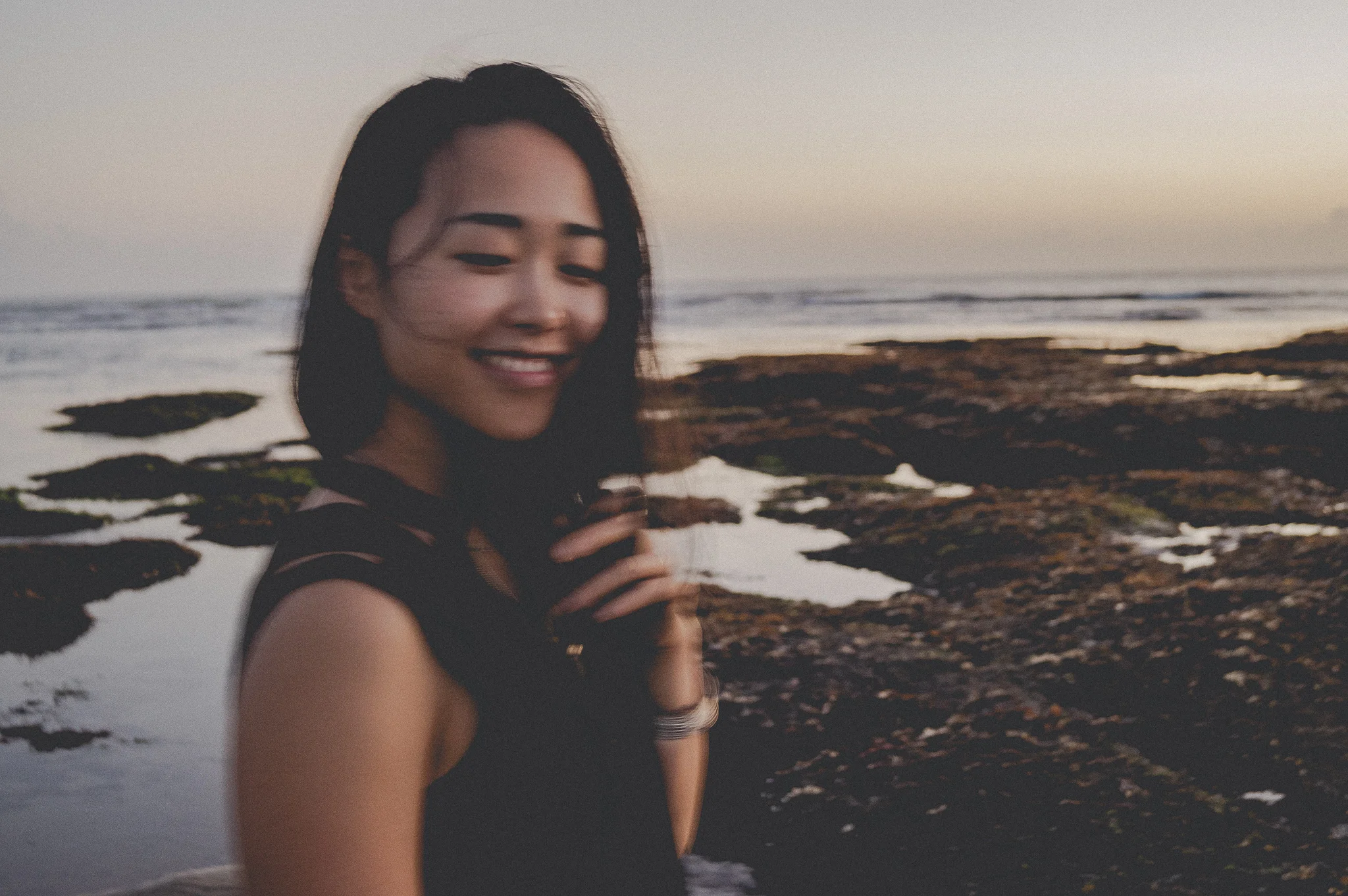
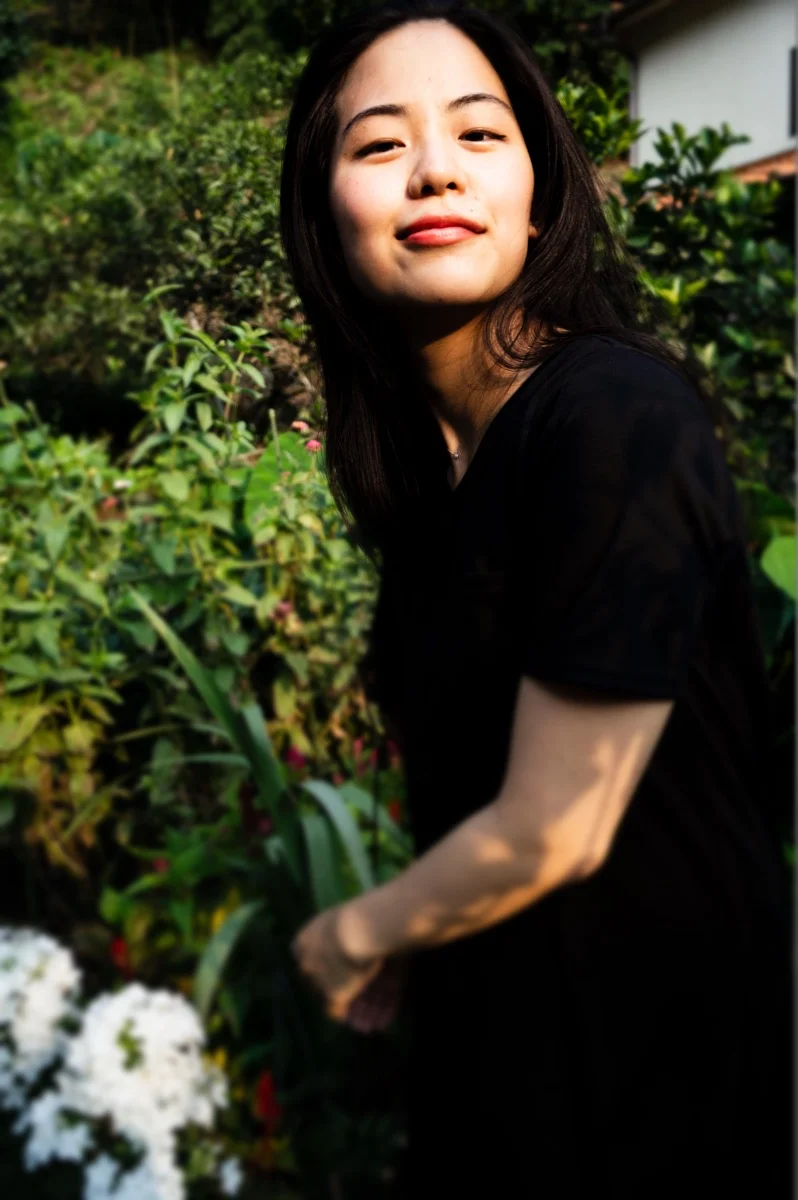
It takes time to master all, and I have not learned all elements correctly, yet. But today, I focus on showing how to practice cropping the 4. Moments and 6. Perspective (especially angle) in your daily life moments.
Let's get started.

First of all, grab any frame you have. If you don't have a frame, get a thick paper and cut inside by leaving 2- 3 cm all the corner of the paper.
Now, you go around your home (or outside), and put a frame, like covering objects, over what you see in front.
Next, slowly move the frame to up, down, right, and left. It could be diagonal. Once you find the best angle and perspective, grab your phone and take photos along with the frame.
That's it. Super easy.
Your eyes won't catch the moment right away, but the more you practice, the more you get used to seeing the best angle and perspective of the scene. It means the speed of you determining which objects are included gets faster, and you can take more photos, and more variety of photos can come out.

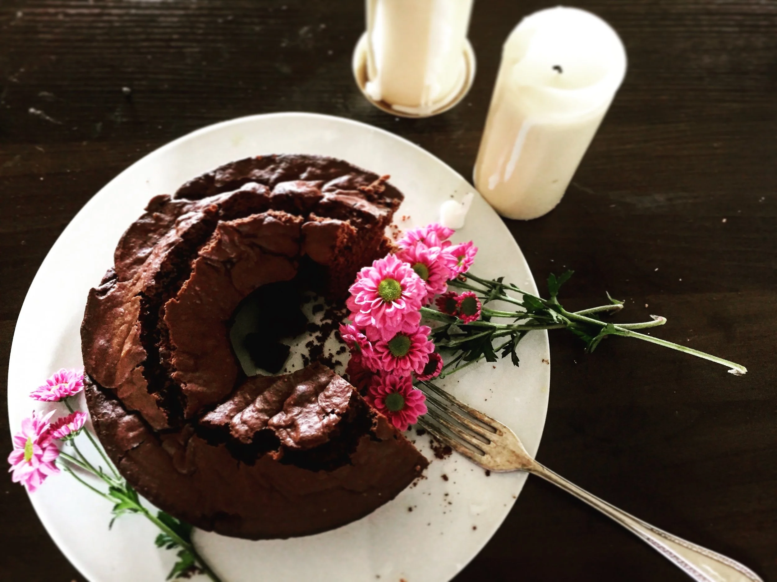
This is a photo from the morning. I thought that my usual morning routine, checking SNS while making a coffee could be a “scene” and added flowers onto the kitchen table.

This is from one of the Saturday mornings. I cooked cacao banana flour-less pancake and did figure drawing while eating them.

My grandma used to use this purse for a long time. After she passed away, I’ve been using this purse. surprisingly,It’s made for my camera in size wise. And it still has a space left. Love it.
Now, you know how to, so practice with your real life scenes; after cooking, or during cooking, having a tea, after shopping, during running, in receiving a package, etc.…
Anything you think normal or even a scene you don’t notice can be photogenic.
So, here I leave examples of photos I took, only the food photos made for my breakfast, lunch, and dinner. Please ignore the colors and white balance, but focus on angles and objects with food.


Hope you will practice and find your own way of photo shooting : )
Thank you so much for reading, and see you in the next post.