Tips for creating decorators by yourself by harumi


Someone asked me that where I take product photos and where I buy those little accessories for the decorators. 

So, I was wondering how I do that? (thank you for your challenging questions!)

Here are the answers and would like to provide a small tip for your creating process of decoration goods. 

First of all, 
1. I don't have the studio, unfortunately. Take product photos at home with natural lights. 
2. I don't buy accessories or small goods for the decoration of photos. But I make them by myself. 

Today, I am going to talk about #2. (I have some ideas of instructing how to take photos at home for your food or any objects you would like to take. It will be covered sometime if there is a request for it.)


Let's get started. 

So, I would say that my creating process of decorations comes from those three concepts. 


Concept 1: 'Keep them alive.'

Concept 2: 'Make it re-born.'

Concept 3: 'De-Construct and construct.'

Too subjective? Let me make the concepts objective. 

Concept 1: 'Keep them alive.'

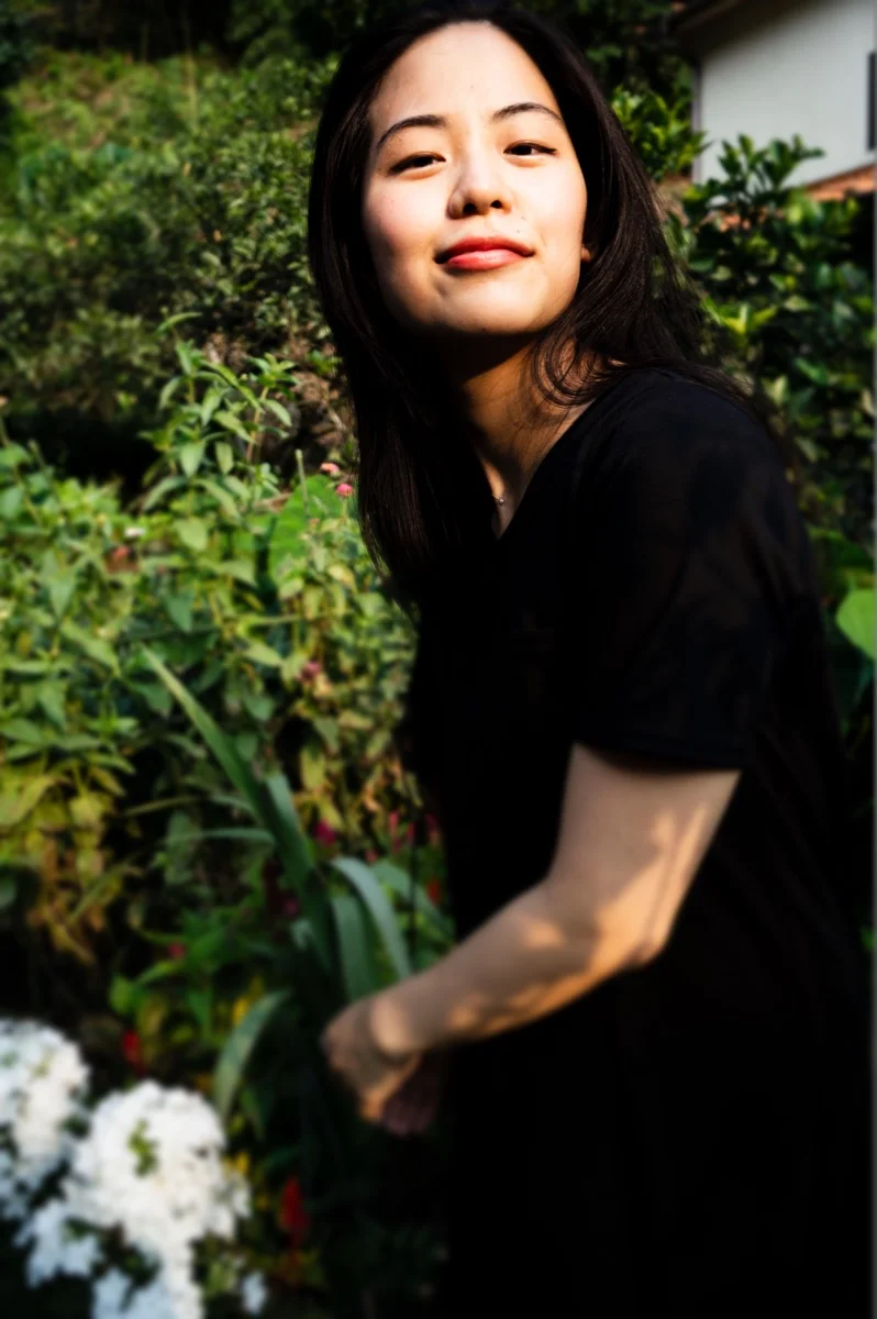
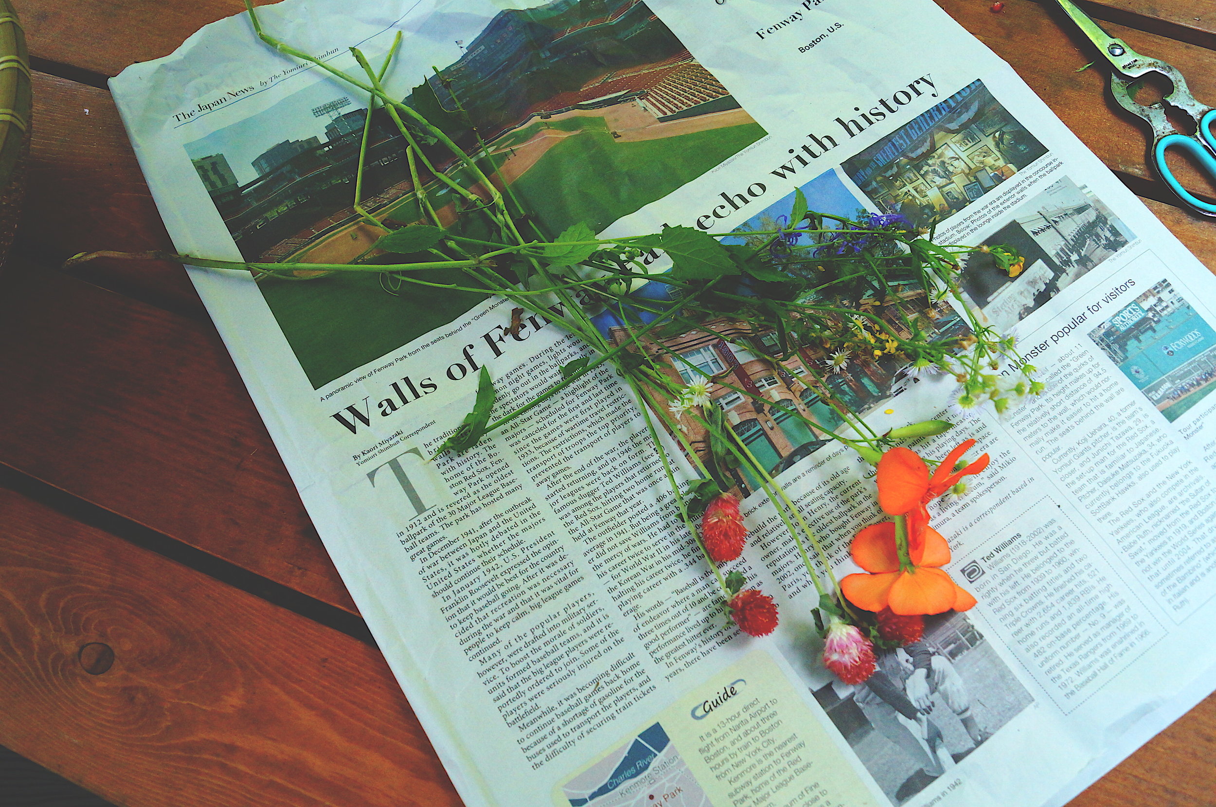
I've been a big fan of flowers and plants at such a young age. So I buy flowers, but also I have them in planters. If they are blooming 110%, I take them out and leave them under the AC and make it dried flowers. So then, I keep them in a jar or a box. Or sometimes I pick them up on the street. (I seriously do.) and take them home. 
Yes, that simple.... so not sure if this could be a tip. But what I want to roll out here is that all small goods you can buy at a rustic antique shop or boutiques can be created merely by your self without efforts. 
Because of its disposition of natures, they die if they live 120%. So before it happens, keep them alive as dried flowers. 


However, if you have a voice in your mind now, "well, can I just buy a bunch of flowers from the store? " Yes, you can. If your flowers nicely dressed up by a florist, keep it in shape and make it dried flowers as the same process above.  You can use it as the home decorator. 


Those dried flowers are going to be antique rusty colors when you shoot. It is going to be perfectly matching with the trendy object or something lively appearance. 
As I wrote in the previous post, those decoration goods drastically change your photo look and give essence to the scene right away. 

Please try them out for your next shooting! 


In the next post, I will cover the concept 2: 'Make it re-born.'
Thank you so much for reading, and if you have any questions, please email me.  : ) 
 

How to edit a portrait photo like vintage style by harumi


This post is about Portrait. But beside of portrait photo techniques, I'd like to cover 'how to edit a portrait photo like vintage style.' This editing works out mainly in the scene along with flowers or the forest. 
(*The technical side of shooting the portrait, please give me time, and I will post about the topic. )

Here, the photo above is my sister, and we had this shooting at the grandma's house last month. 
I like her smiling, but also her eyes look at the lens with the look "I know how you do." It was just naturally collaborated with my sister. Love it. 

After posting the original photo on Instagram, maybe this photo could be right in the vintage style. 

So here how I did. (Please click the right side of the photo below to see other adjustment tools)

Used VSCO


1. Contrast
I usually like high variations, but this time skipped contrast. It's because the original photo has the strong color differences in its antithesis, and this photo would want to go with the low-tone vintage look.  So I got them even -2.0 to make her and black tops look softer. 

2. Sharpen/Clarity
Those are important in a portrait shot. I like high sharpen and low clarity personally. But again, because of the original photo had a good resolution in it, so just left Sharpen +4.0 and clarity is as usual, between +2.5 and +3.5. 

3. Saturation/White Balance
Those are easy. Make sure that you always control those two elements for colder or warmer look. Again, if you could adjust 'Saturation' and 'White balance' for cooler/warmer looking, you can make any types of photo styles. 
This time is about vintage look, so saturation is -1.0 (did not go over beyond since the filter and contrast gave enough greyish tone. ) 
In White Balance, green was a little bit went beyond that I usually do, and it's also connected to the next step. 

4. Skin Tone
After editing so much to make the photo look greyish, greenish, and low-tone, we cannot just leave without adjusting the face color of the person. 
So when you adjust Saturation/White Balance, remember that changing Skin-Tone comes as a combo set. 

5. Fade/Grain
Finally, Fade (!).  Fade dramatically works out the portrait vintage look photo. The tools provided a photo softness and polished in the way of "polled off." 
I actually (well, at least for me) challenged to +5.0. Adding Fade is my nervous point in editing. It's because it could ruin colors, contrast, or even the feeling of the object's character. But sometimes have to try this out drastically to break our comfortable zone. And I don't think I perfectly got this done. But I am happy that I could try to go beyond my comfort area. 


--------------------------------------------------------------------------------------------------------------------------------------------
Lastly, let's go review.  
1.
Contrast could be the negative number if a model outfit is too dark or the original photo has the strong color sense. 
2. High Sharpen is a key to define the face, but Clarity could kill the softness of the portrait face. 
3. Control Saturation and White Balance and keep your eyes on the balance between the filter strength and those adjustments. 
4. Use Skin Tone always after Saturation and White Balance to modify a model's skin color. (It's ultimate priority to make her/him look in a certain way.) 
5. Level of Fade is under your preference. Use Fade for the portrait that gives the sense of the softness in the end. 


Thank you so much for reading. Hope you got learnt something from reviewing the photo with me. 

See you in the next post :) 


Break : Snapshots from the summer time in 2015 by harumi

Photos from summer back in 2015, just Soumen lunch with my family. 

Those photos always remind me that how fun is just taking pictures whatever I like without thinking any specific conditions. 

While I like striving for the excellent shot for photography, I naturally love catching the moment of my life and the people around me. It's just because people and objects are JUST there unintentionally. 

Genuinely, I love the time of eating, listening to music, and dancing. 


How to edit a photo taken by your phone (clear light look) by harumi

Hi there, again! 

As I promised in the last post, I would like to guide you 'how to edit a photo taken by your phone with a bright/clear light look. 
This mainly works out for the nature scene or food at the cafe. 

For a bright/clear look, I usually use 1) Photoshop mobile app. 
The app works out pretty well on enhance and make a picture clearer. 
So it's not focused on for Instagrammed looks or vintage style. 
It's for the situation that you took a photo where no light and only the natural light is available. 
In the situation, you still can make your photo at least the decent level to share with someone. 

So let's get started. 

-----------------------------------------------------------------------------------------------------------------------

I took the photo here last week when we had lunch at a Japanese restaurant. It was a beautiful atmosphere around the old traditional house. I sneakily took a picture of outside garden below from the room I was eating. 

This looks very ordinary photo taken by a mobile phone. For the nature photo including a building is actually an excellent component to define light and contrast on a picture. 
To add lights on greens, contrast, and white balance can be done on Photoshop. 

before editing demonstration, let me give you a tip on an angle. 


Angle
When you want to take a photo of a part of natures, include a pillar of a part of the building on the bottom or the left side of a photo frame, but do not make them focused in the structure. It just an optional object to pull out the bright green side/blue side of the primary purpose, which is natures. 

Although the photo above is from the corner, I personally like the edge from the bottom and look up at the trees because it gives a picture has the feeling that audiences are inside the forest. 


-----------------------------------------------------------------------------------------------------------------------

Edit
Let's edit the original photo. 
Here is the process of editing on Photoshop Express. Please take a look. 


Shadow: -50
Black: -70
White: -104
Tint: -27
Exposure: 8
Clarity: 45
 

Tip1: Enhance
First of all, Photoshop has the tool of Enhance. I set up that it automatically applies to an uploaded photo onto the app. This time, I did not use the device because Enhance actually deleted the colors of different colors of greens. 


Tip2: Filter
Next, choose your favorite filter. I usually use 'Koi.' It gives automatically adjusted contrast, shadow/light, and white balance.
But here is a warning part. Filter level is auto adjustment setting, so you need to adjust by yourself if it's too bright or too dark to make your photo your style. 

This photo below was done by the automatic setting.  As compared with the #1 photos of the editing process, you can see the automatic setting filter is too blight and kills the greens by lights, and also a whole definition of the photo is broad. 

The right side: Self-adjusted
The left side: Automatic adjustment


Tip 3: Crop
An advice here is that 'Crop.'  As mentioned above, having a pillar or additional object with a snapshot nature scene provides a picture of the sense that you sneak peak the moment, and audiences feel they are in that. 

When the photo includes a pillar or something objects, I'd recommend to add them on the bottom or the left side of the frame. 

In the original photo, I had the winder frame and pillars from the left side through the right side. The perspective, which the image is getting open to the right, is psychologically useful since the movement of human or objects from left to right means from the past to the future. 

However, I cropped them off and left the bottom side and a little bit the left side. It's because the primary purpose here is the traditional green garden outside, and pull out the beautiful lights and colors. So I left only the limited parts of the pillars and the window frame. 

Tip4: Exposure
Exposure is a handy tool in a nature photo, particularly in a lot of greenish pictures. It's because greens are the opposite color of the sunshine orange color. So this creates a sharp contrast, and lights give greens shiny in their way. 

However, Exposure does not work out well in a content of no contrast or definition in the original photo. Let's say that the bright sunlight with the beach sands. It becomes just a "bright" photo. No playful space on that. 

This time, I added Exposure because greens are the primary object and the sunlight perfectly looked from the behind leaves. So basically, I pulled the sunshine light out to stand them out. 
 

------------------------------------------------------------------------------------------------------------------------------------------

Lastly, let's go review... 
1. Include an additional object on the left side or the bottom to feel inside the scene.
2. Use Enhance to polish your photo first. BUT not necessary in case it brews the colors off. 
3. Don't trust a Filter 100% and always your eyes are the last key.
4. Crop a photo in the perspective of getting open from the left side to the right side. 
5. Have Exposure (bright light) onto the whole picture to lighten up the primary object's color. And only use it for a photo already has contrasts. 
 

If you have any questions, suggestions, or photo style you want to learn, please email me. 

Thank you so much for reading. : ) See you in the next post!